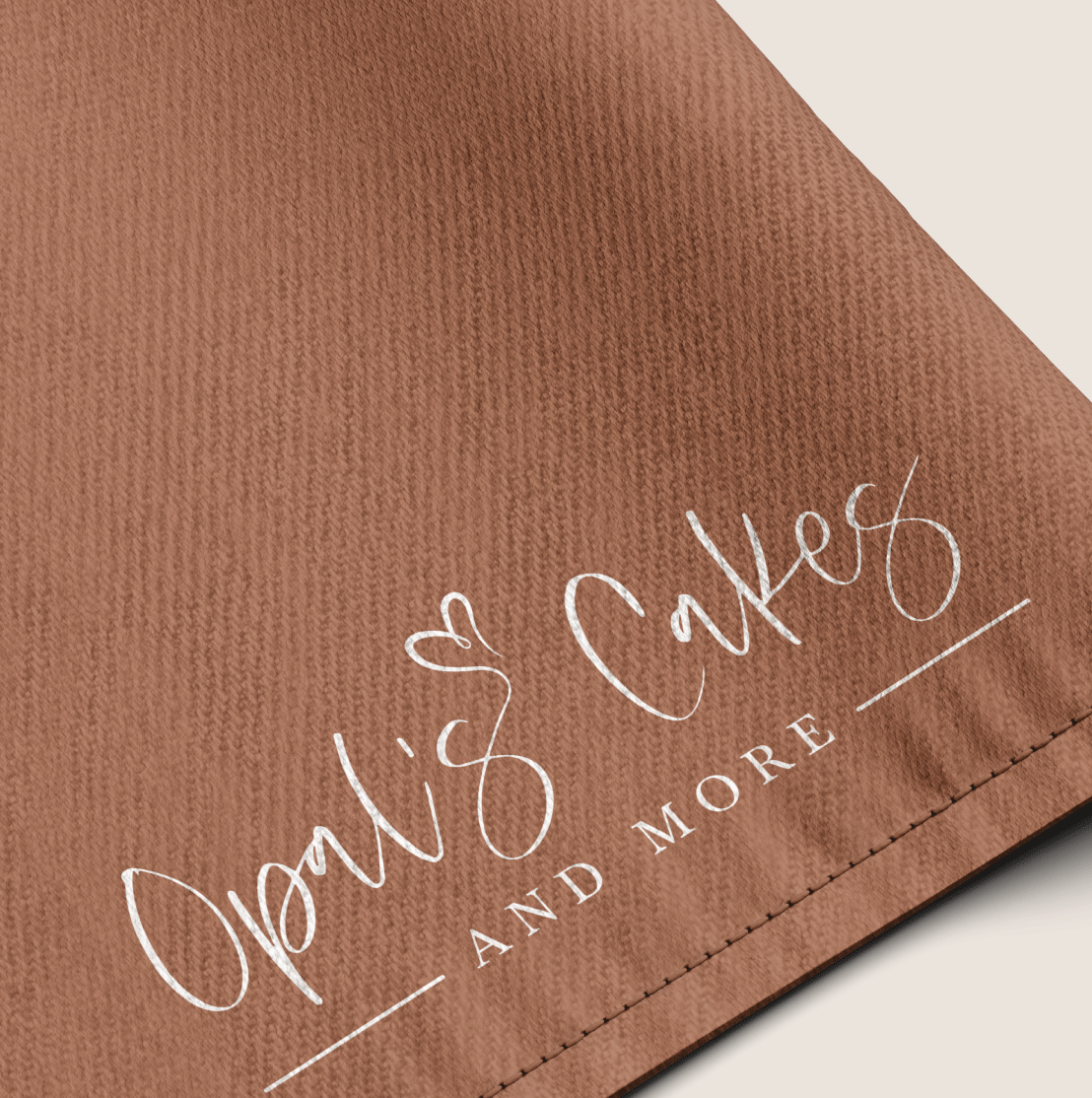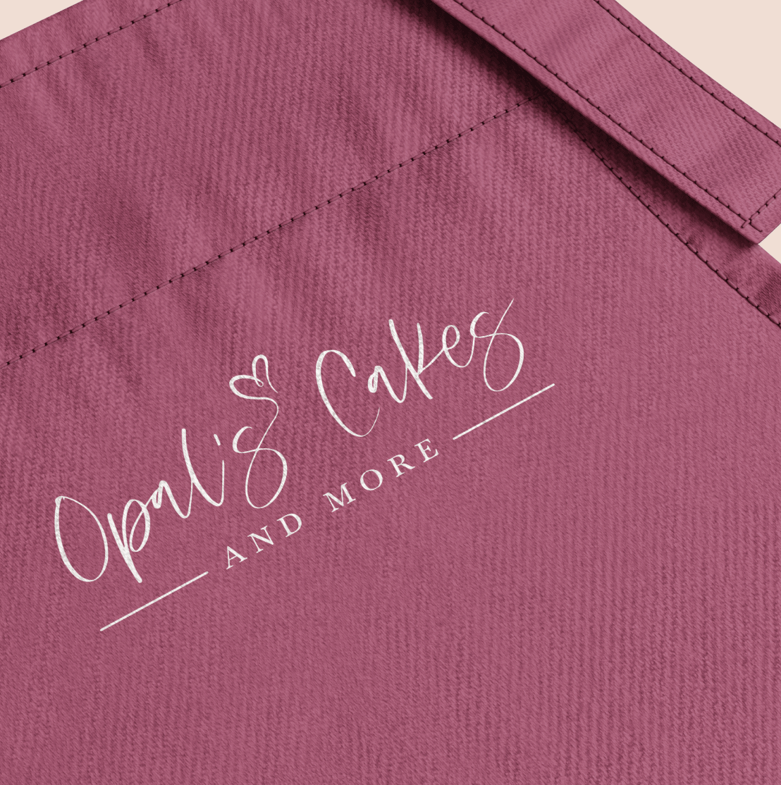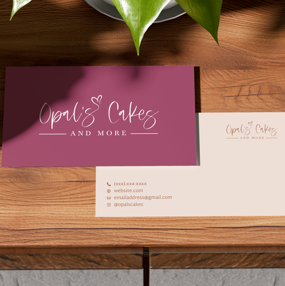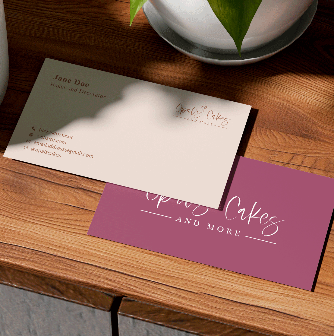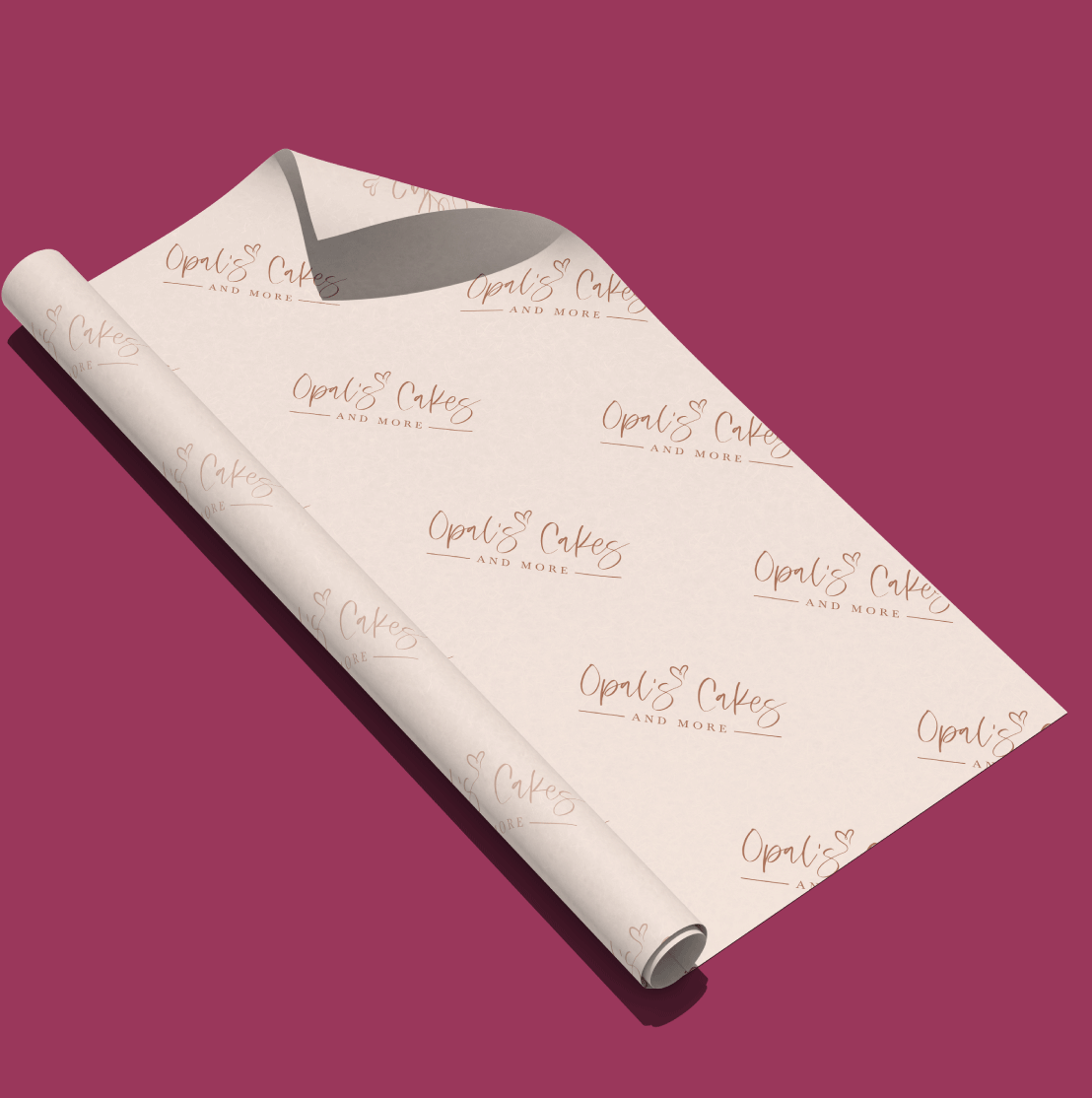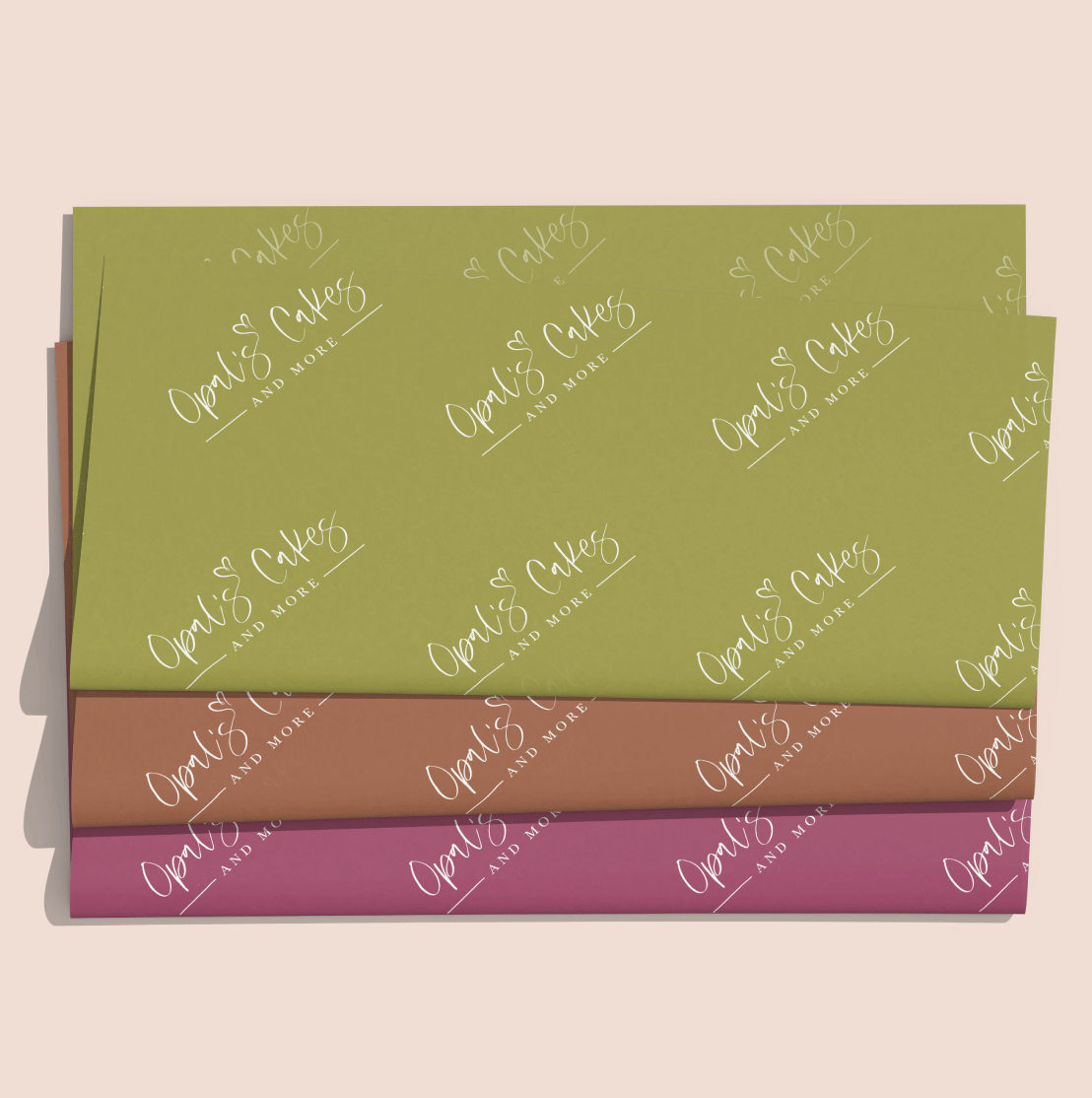
Opal's Cakes & More is a small, home-based baking business that needed its first visual identity. The owner approached me to create a logo that felt professional, cohesive, and reflective of the care bhind her cakes. I also extended the identity to business cards, giving the brand a more consistent and recognizable presence.
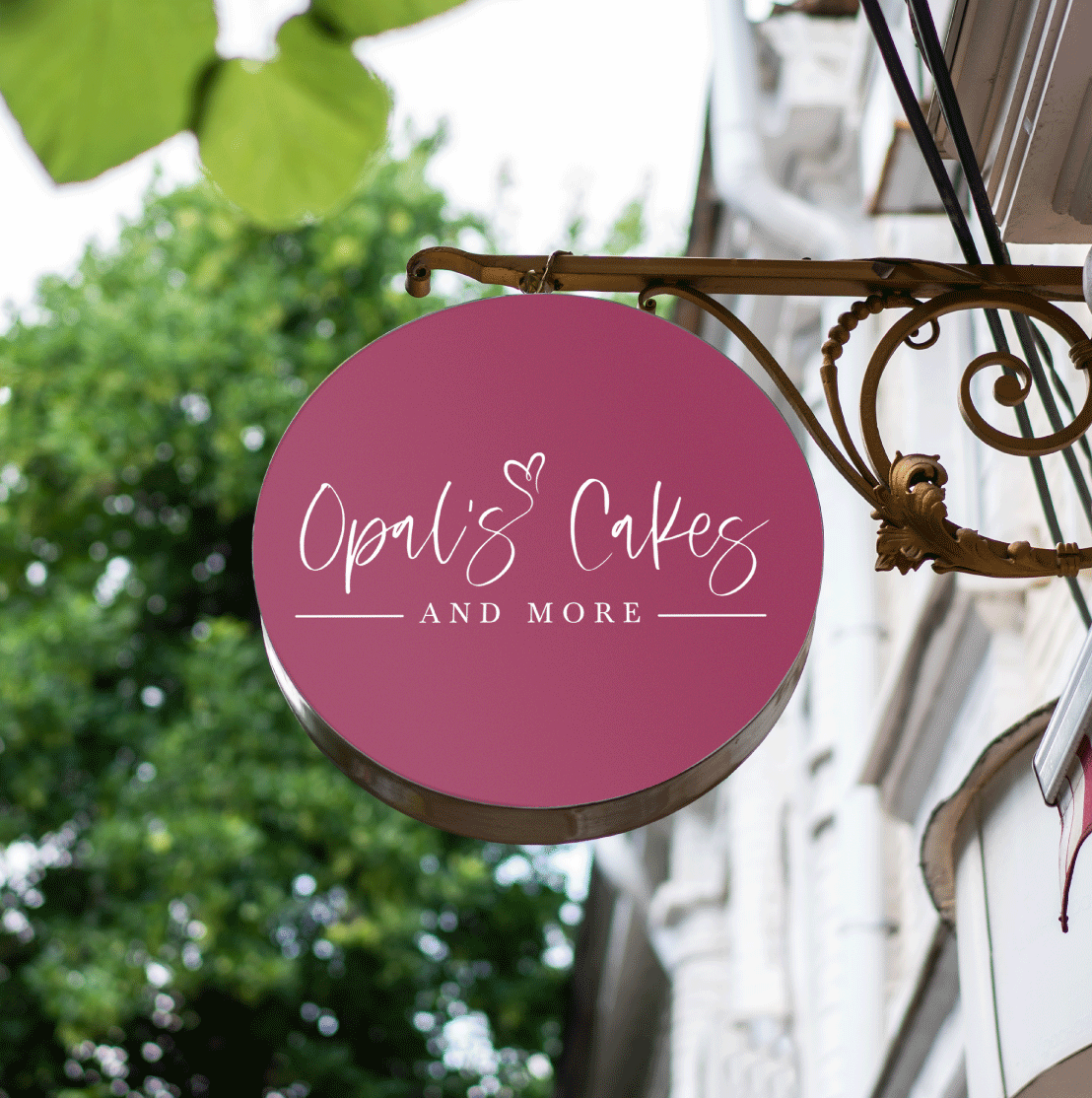
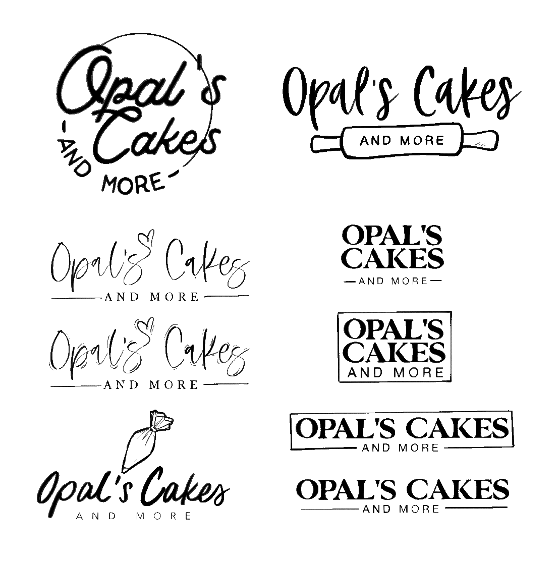
To reflect the warmth and handmade character of the business, I wanted the branding to feel inviting, familiar, and personal. I drew inspiration from rustic farmhouse aesthetics and traditional bakeries, while focusing on design elements that conveyed comfort, care, and authenticity.
The final wordmark pairs a modified script typeface with serif typography, balancing warmth and authenticity with structure and legibility. I extended the tail of one letter to form a heart, adding a memorable detail that reflects the care behind the business.
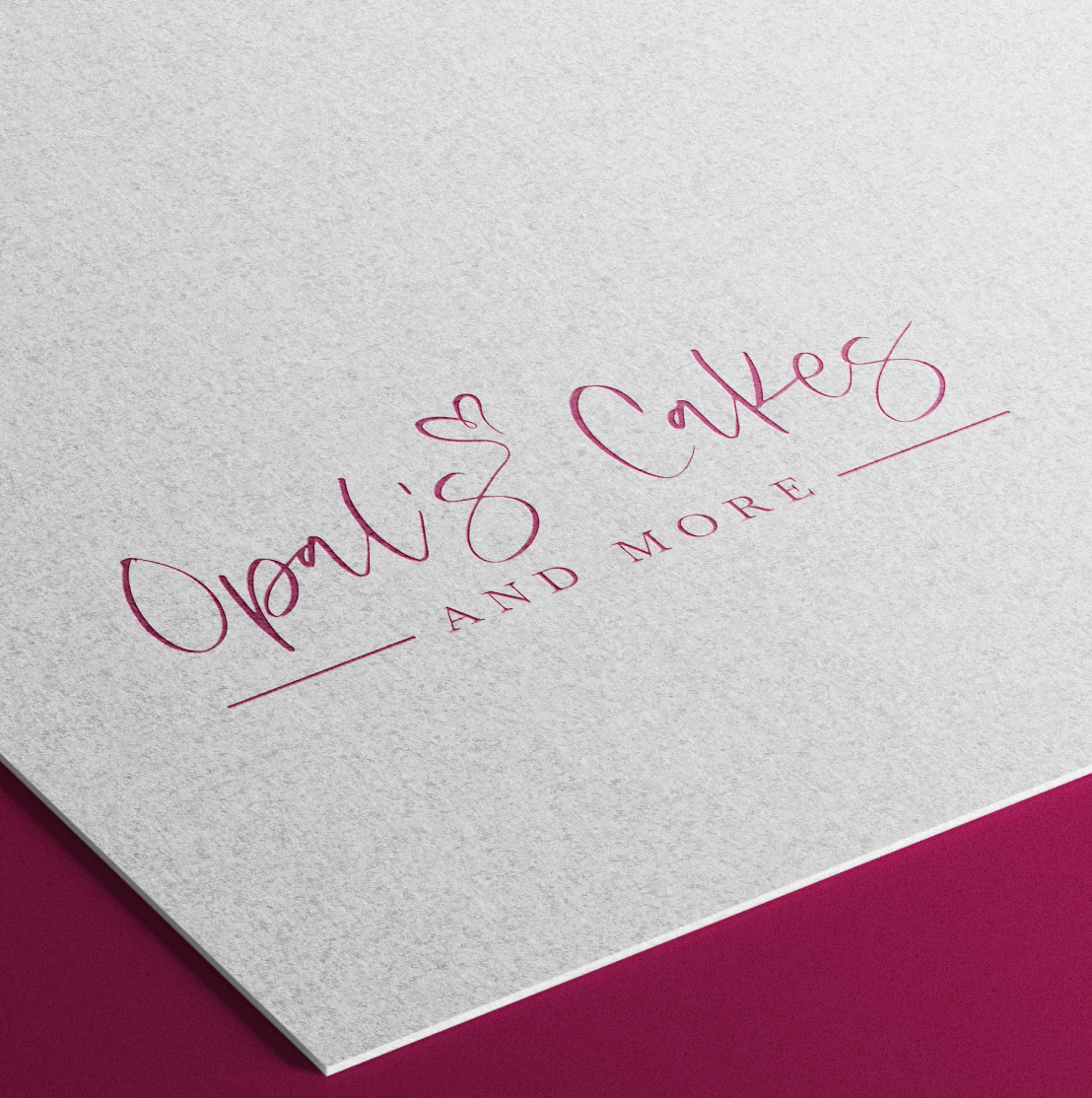
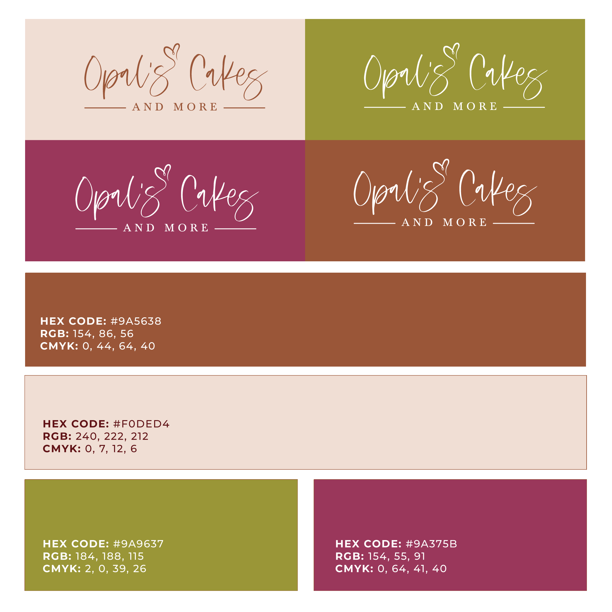
The color palette combines warm neutrals with earthy accent colors inspired by rustic farmhouse kitchens and baked goods. The softblush creates an inviting foundation, while olive, berry and reddish-brown tones add warmth, richness, and flexibility across brand applications.
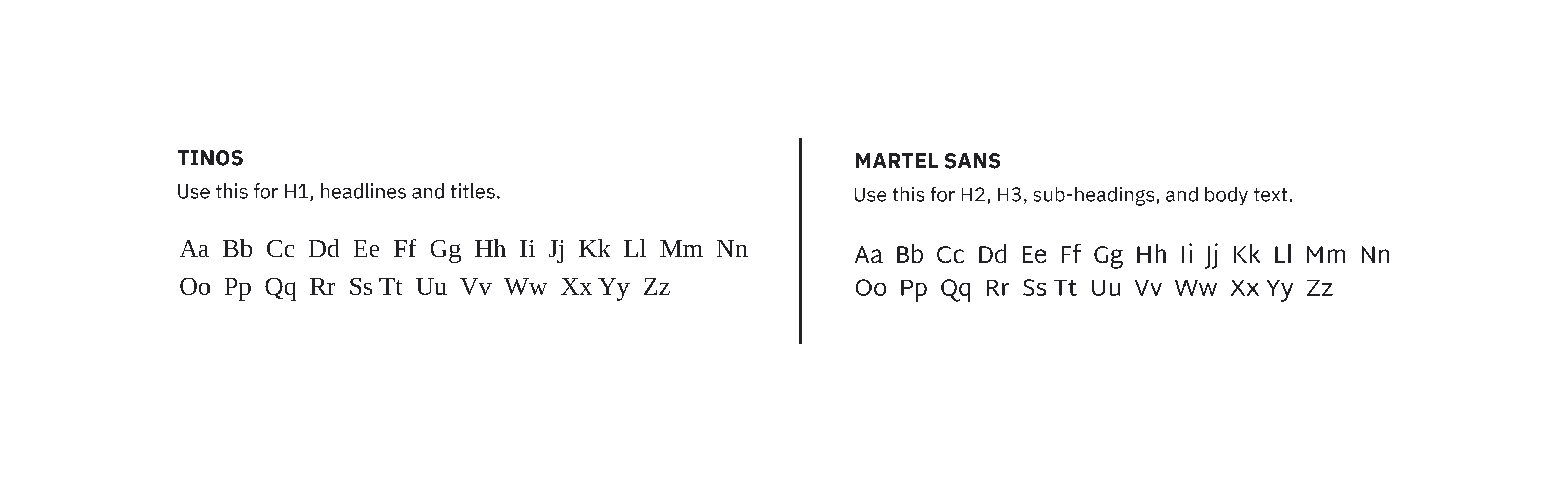
The supporting typography pairs Tinos with Martel Sans, balancing warmth and readability. Tinos reinforces the identity's classic, rustic character, while Martel Sans provides a clean, modern contrast for supporting information.