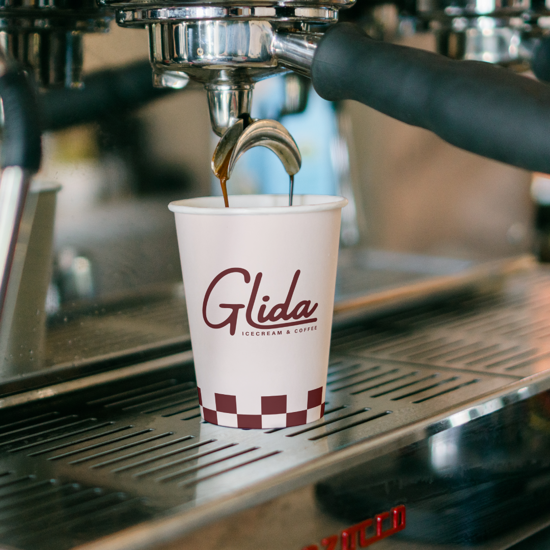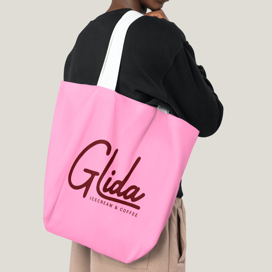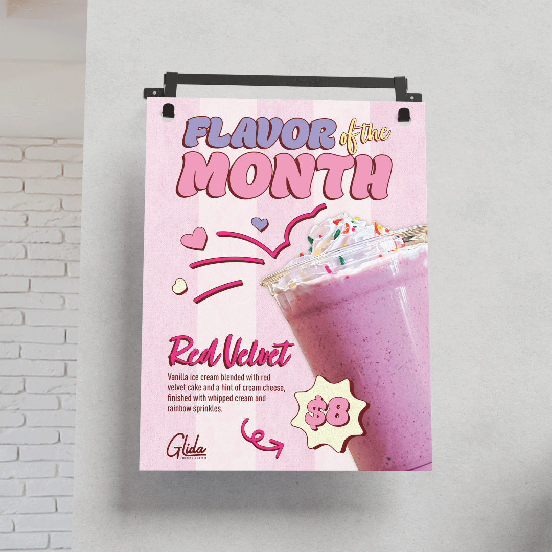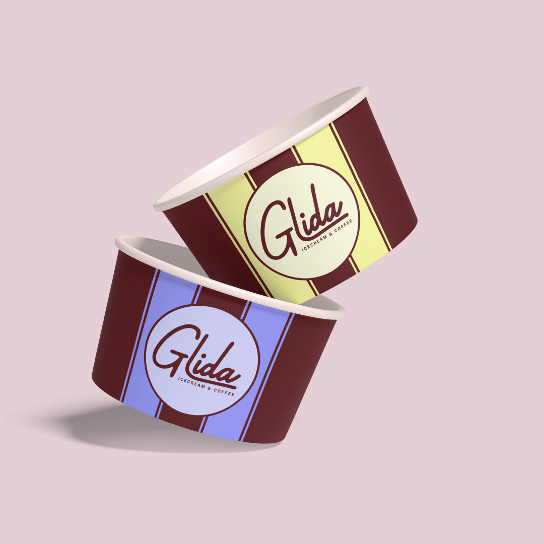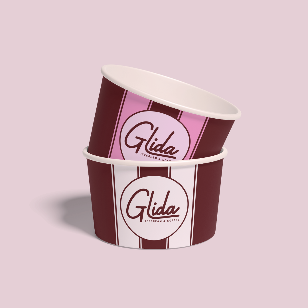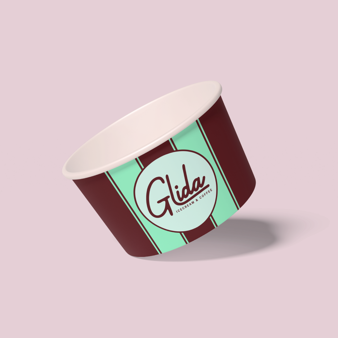
Glida's was originally a frozen yogurt shop located within Dezerland Park. It was being repositioned as an ice-cream and coffee shop. As part of a larger initiative to refresh several businesses throughout the park, I redesigned the logo and began developing a new visual identity. Although the project was placed on hold before completion, the work established a new direction for the brand.
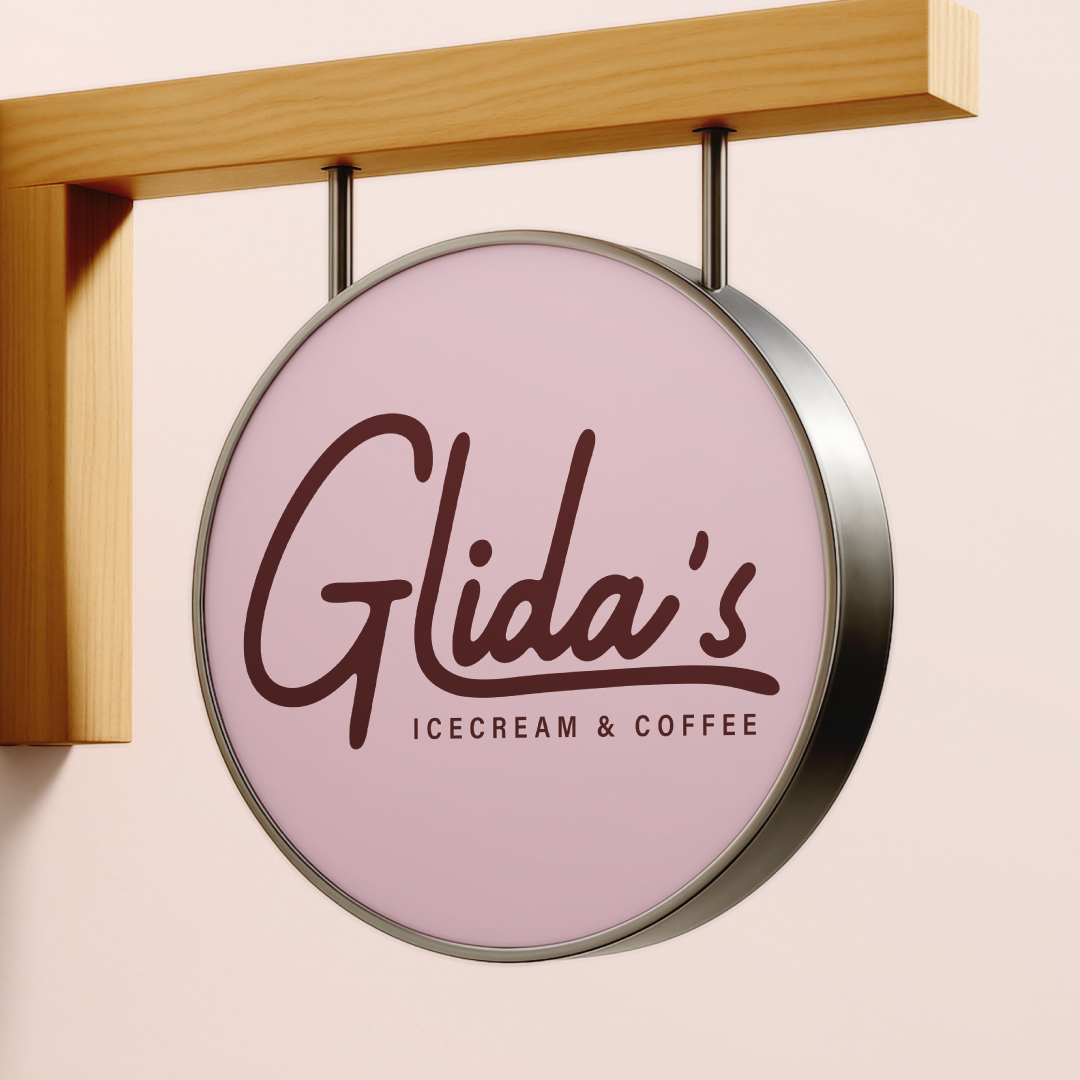
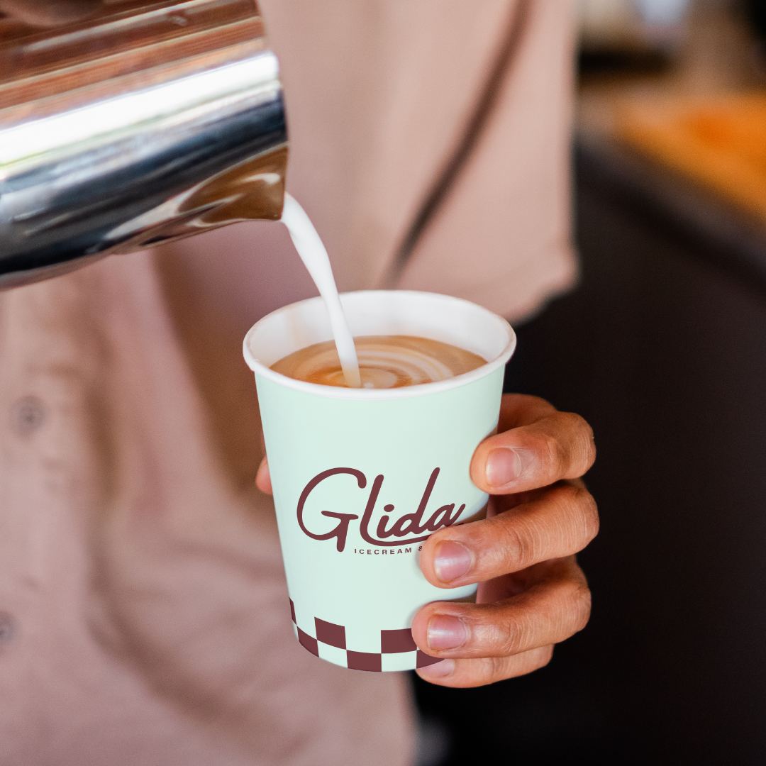
As Glida's expanded beyond frozen yogurt, its existing branding no longer represented the business or what if offered. To create a more cohesive and recognizable idenity, I developed a visual direction inspired by 1950s malt shops and soda fountains. I researched the era's role in community and car culture, along with its typography, colors, patterns, and graphic styles. I focused on combining nostalgic design elements with clean, modern design to create something playful, approachable, and well-suited to Dezerland Park.
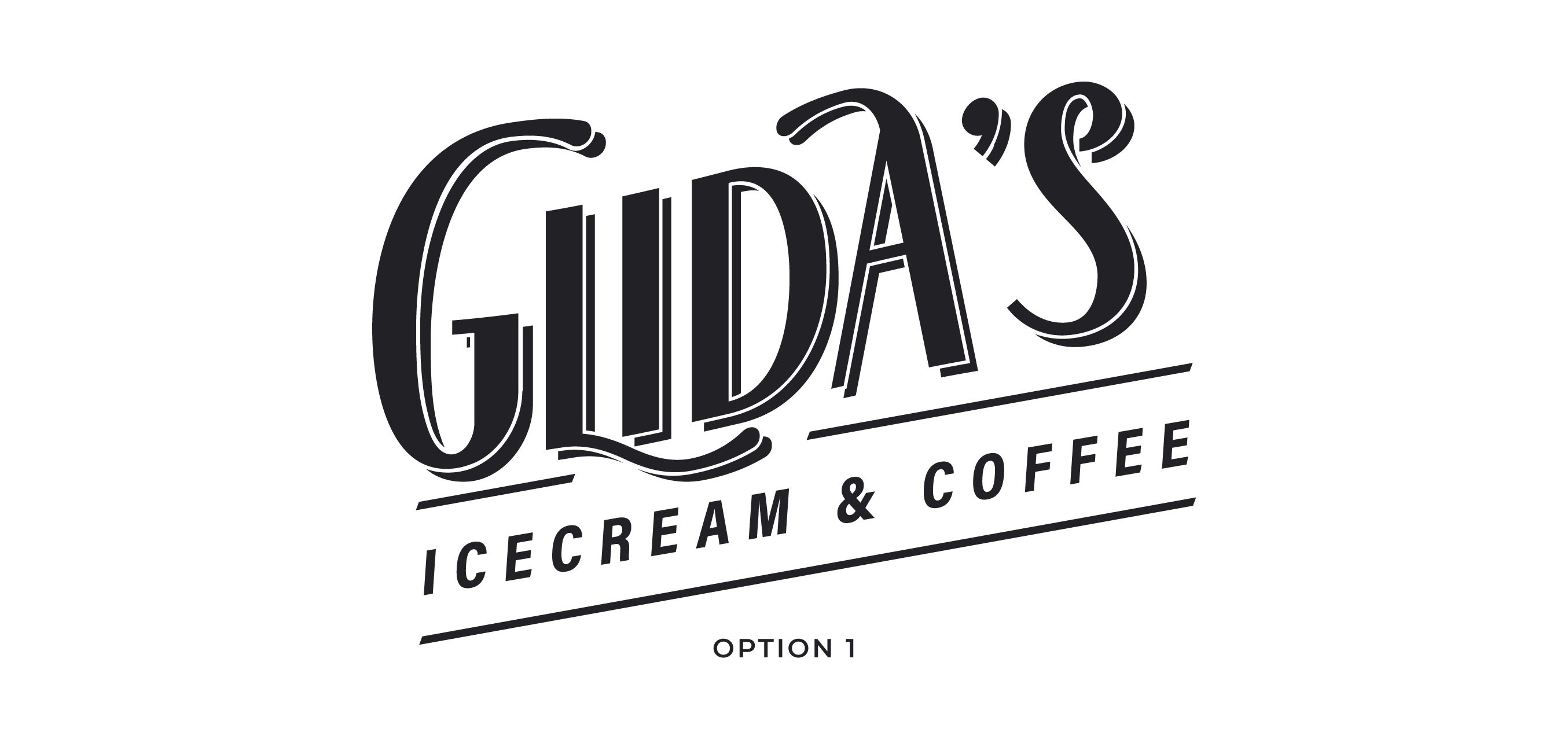
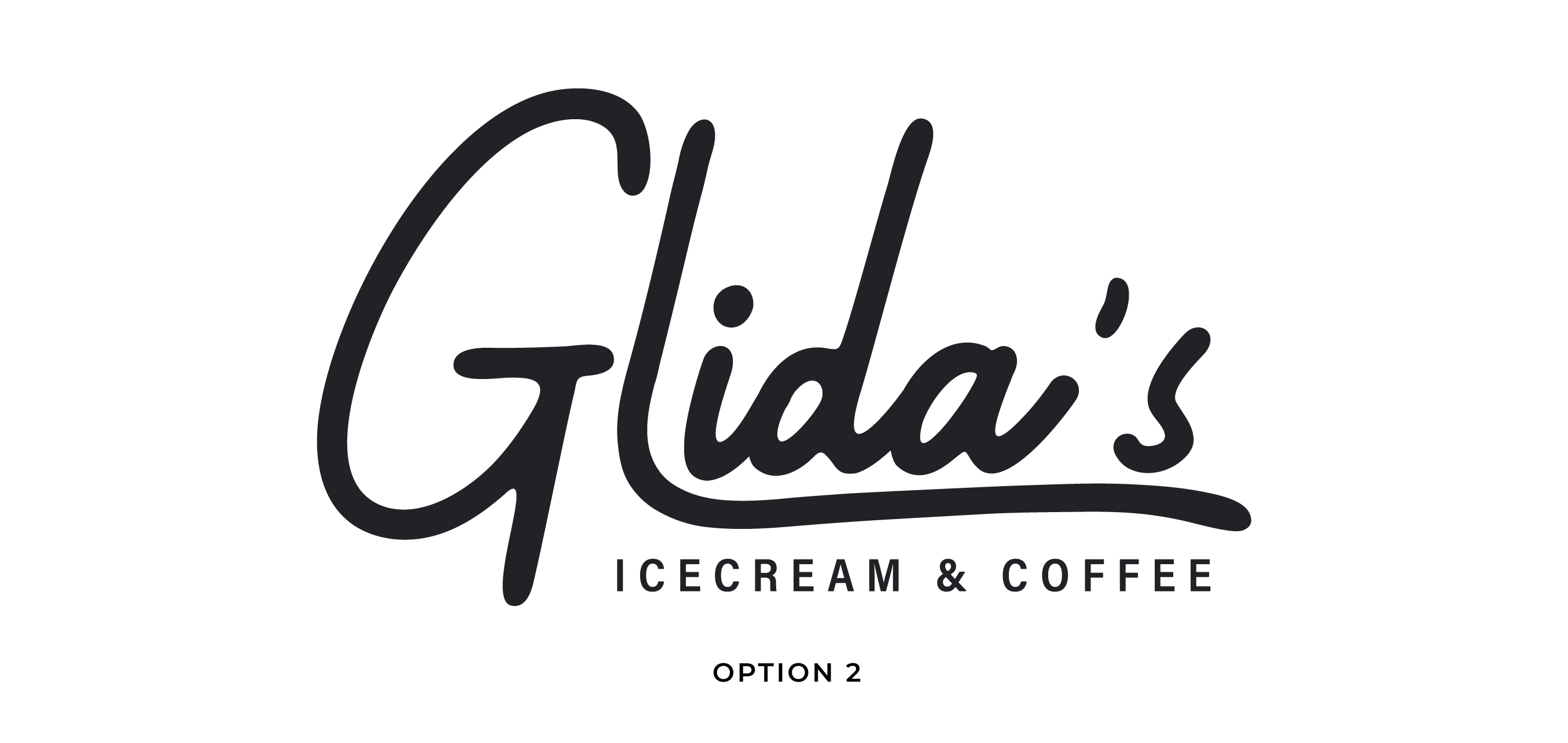
For the redesigned logo, I created a flexible wordmark that could easily translate across applications such as menus, cups, and aprons. Inspired by the neon signage of the 1950s, the lettering gives the brand a nostalgic character without feeling too tacky. I kept the wordmark simple so it could pair naturally with the new color palette, patterns, and other supporting graphics.
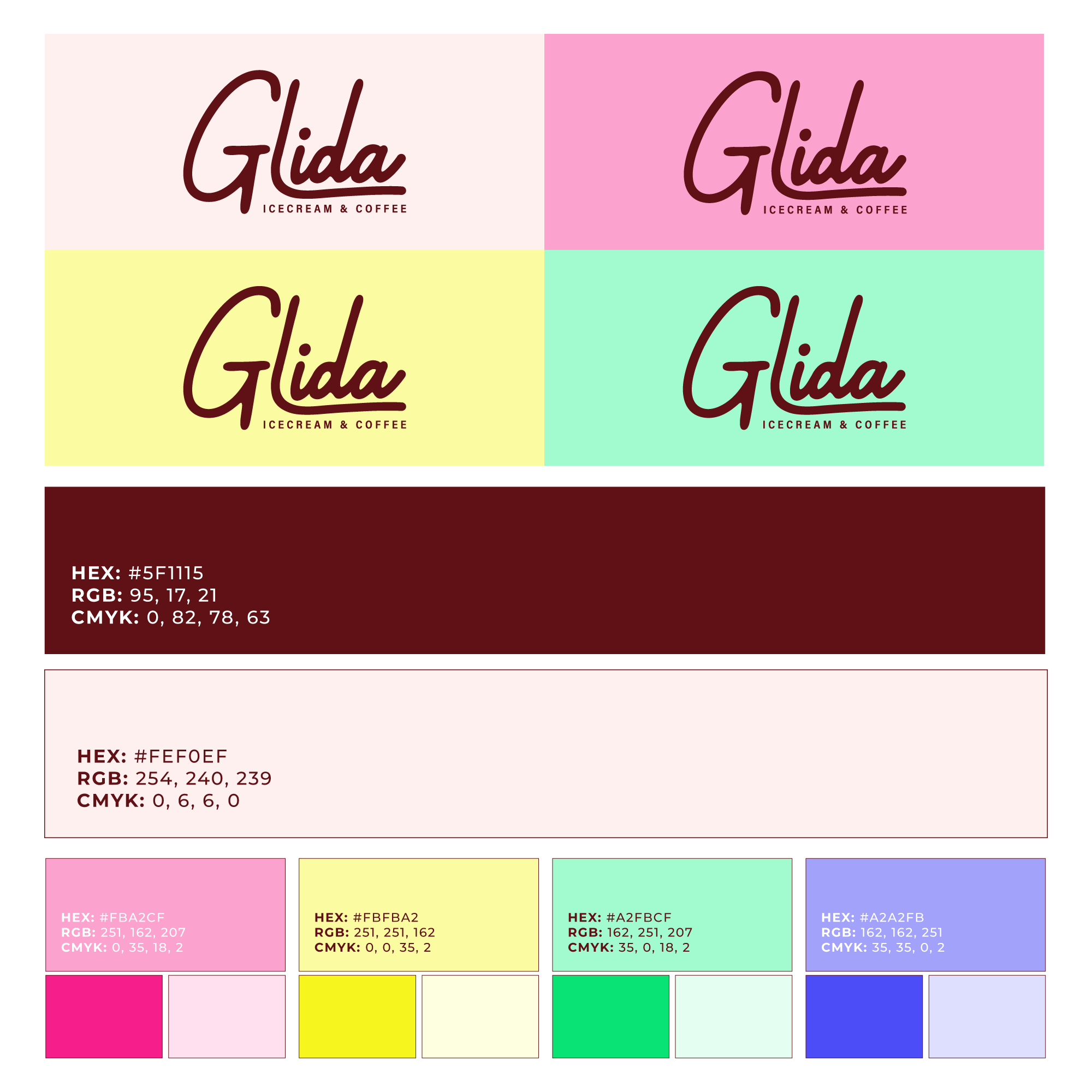
Inspired by popular color palettes of the 1950s, I selected cheerful, vibrant colors that evoke warmth and nostalgia. I focused on curating a palette that would pair well with neutral colors, giving it flexibility across applications.
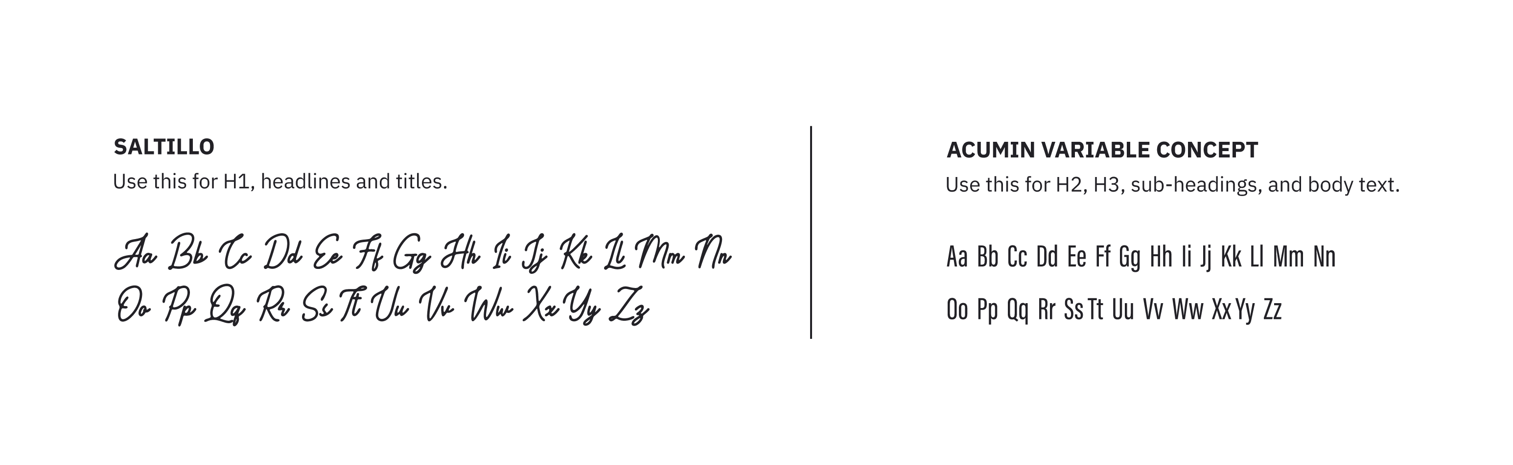
To balance the brand's retro character with everyday usability, I paired a handwritten script style with a clean, modern sans serif. Glida's wordmark uses a modified version of Saltillo, while Acumin Variable Concept provides contrast in the tagline and supporting information. This pairing gives the brand personality while keeping menus, prices, and body copy clear and legible.